
We already used scroll-driven animations to build a carousel that animates as you scroll through it. This time, let’s push the idea a bit further: instead of animating something inside the scrolling container, we’re going to sync elements that live completely outside of it.
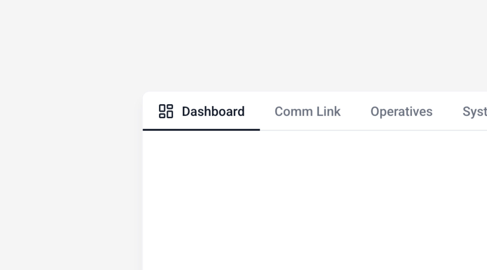
The goal: a tab bar that updates itself (active color, sliding underline, icon reveal) purely based on which panel is currently in view. No click handlers, no scroll listeners, no JavaScript at all for the animation logic.
Here is the final result:
What we are going to look at closely here:
timeline-scope: modifies the scope of a named animation timeline.animation-timeline: specifies the timeline used to control the progress of a CSS animation.view-timeline: defines a named view progress timeline’s name, direction, and inset values.
Let’s dig into it.
The base structure (HTML)
The markup is split into two independent blocks: .tabs, which holds our buttons, and .content-scroll-container, which holds the scrollable panels.
Pretty simple, here is the base we are going to use:
Give each panel its own scroll timeline
For a tab to know when its panel is in view, the panel needs to expose a named scroll timeline. That’s what view-timeline does:
.content-panel {
  &.panel-1 {
    view-timeline: --panel-1 inline;
  }
  &.panel-2 {
    view-timeline: --panel-2 inline;
  }
  // panel-3, panel-4 follow the same pattern
}--panel-1is just a name we’re inventing for this timeline.inlinemeans it tracks the horizontal scroll axis (same logic as in the carousel article).
At this point, each panel has its own personal “progress bar,” running from 0% (entering the viewport) to 100% (leaving it).
The reason it’s 0% when it enter and 100% when it leaves is because of another default property: animation-range, which is “cover” by default
The best way to figure it out is by adding updating a @property, scoped by panel.
We register the CSS variable.
@property --progress {
  syntax: "<integer>";
  initial-value: 0;
  inherits: true;
}
For each panel, we specify the timeline used. with our previous `view-timeline: –panel-1 inline;`. Must be done for every panel.
.panel-1 .progress-block::after {
  animation-timeline: --panel-1;
  animation-range: cover; /* Default  value, try “entry” to see the difference*/
}
We display the variable as a text
.progress-block::after {
  animation: count-progress linear;
  counter-reset: percent var(--progress);
  content: "Scroll scope: " counter(percent) "%";
}
We update the variable based on the scroll position of the animation-timeline
@keyframes count-progress {
  0%   { --progress: 0; }
  100% { --progress: 100; }
}
Now, every panel will have a “local” --progress variable based on their current scroll.
See it here:
The problem:
If you want to access this timeline outside its container, it’s not possible. We need to make the timeline global.
Let the timeline escape its container
Here’s the problem: by default, a named view-timeline is only visible to the descendants of the element that declares it. Our tabs are not descendants of .content-panel, they’re siblings, sitting in a completely different branch of the DOM.
If we try to use --panel-1 on a .tab element as-is, nothing will happen.
This is exactly what timeline-scope is for. We declare it on a common ancestor — here, .tabs-wrapper — to widen the visibility of our timelines to the entire subtree:
.tabs-wrapper {
  timeline-scope: --panel-1, --panel-2, --panel-3, --panel-4;
}
Think of
view-timelineas creating the timeline, andtimeline-scopeas broadcasting it so elements anywhere under.tabs-wrappercan tune in.With that one line, our tabs can now reference
--panel-1through--panel-4directly.
Sync the active tab’s color
Now for the fun part. Each tab gets wired to its matching timeline:
.tab {
  color: var(--color-text-muted);
  animation: active-tab-style linear;

  &.tab-1 {
    --color-active: var(--color-panel-1);
    animation-timeline: --panel-1;
  }
  // tab-2, tab-3, tab-4 follow the same pattern
}

@keyframes active-tab-style {
  0%, 25% { color: var(--color-text-muted); }
  50%     { color: var(--color-active); }
  75%, 100% { color: var(--color-text-muted); }
}
The animation itself doesn’t have a duration — animation-timeline replaces time with scroll position. The tab is only colored at the midpoint (50%) of its panel’s timeline — meaning exactly when that panel is centered in the viewport.
With the same trick, you can add a few other effects, with a border effect for exemple. Do not forget to add the timeline to every element you need
&.tab-1 {
   animation-timeline: --panel-1;
   &::after {
     animation-timeline: --panel-1;
   }
}
See the result
And of course, the final result with a few more animations on the tabs:
That’s it! With just view-timeline, timeline-scope, and a handful of scroll-based @keyframes, we’ve built a fully synced tab bar — no scroll event, no click handler, no JavaScript driving the animation at all.
If you haven’t yet, check out the carousel article this one builds on — the fundamentals of animation-timeline are explained there in more depth.