
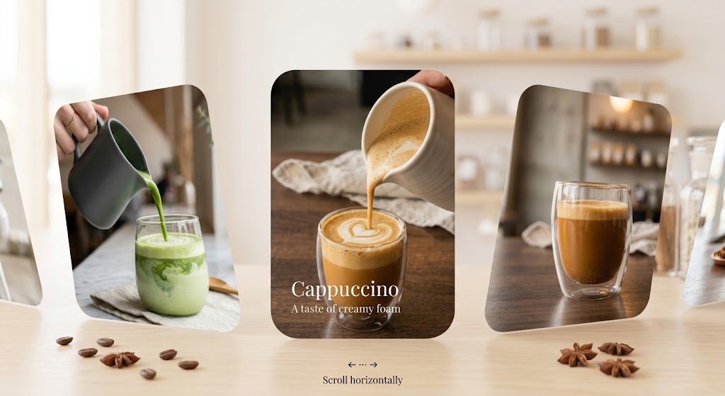
CSS Scroll-Driven animations have been around for a while now. They’re powerful, natively supported by (almost) every browser, and easy to use. They also work perfectly on mobile.
Let’s leave JavaScript aside for a while and build a full CSS carousel with some nice animations.
Here is the final result:
The base of the carousel
Let’s start building the HTML. It’s simple: a wrapper, and some cards:
<div class="carousel-wrapper">
  <div class="carousel-card" style="--image: url('./src/assets/matcha.jpeg');">
    <div class="carousel-card__content">
      <div class="carousel-card__overlay"></div>
      <div class="carousel-card__info">
        <div class="carousel-card__title">Matcha latte</div>
        <div class="carousel-card__subtitle">
          <span>A taste of green tea</span>
        </div>
      </div>
      <div class="carousel-card__bg"></div>
    </div>
  </div>
  <!-- other cards here -->
</div>
.carousel-wrapper {
height: 100%;
width: 100%;
display: flex;
align-items: center;
overflow-x: auto;
overflow-y: hidden;
position: relative;
scroll-behavior: smooth;
// Hide the scrollbar but keep the feature
scrollbar-width: none;
-ms-overflow-style: none;
}At this point, it’s just a horizontal carousel, without any effect:
Notice the snap effect, achieved by adding these properties to our wrapper and card:
.carousel-wrapper {
  scroll-snap-type: x mandatory;
}

.carousel-card {
  scroll-snap-align: center;
}
Scroll driven animations
That’s where the tutorial starts getting interesting.
We want to add some animation on scroll. For example, moving the image inside to create a kind of parallax effect.
The idea is simple: translating the div containing the image (<div class="carousel-card__bg"></div>) on the X axis, from 100px to -100px.
For that, we only need to add 2 things.
On the class where we want the effect, we need to add the animation behavior:
.carousel-card__bg {
  //...
  animation: cardBgAnimation linear both;
  animation-timeline: view(inline);
  animation-range: cover 0% cover 100%;

  // fallback for browsers that don't support animation-timeline
  @supports not (animation-timeline: view()) {
    z-index: 0;
    animation: none !important;
    transform: translate3d(-50%, -50%, 0);
  }
}
And we need to create the animation:
keyframes cardBgAnimation {
  0% {
    transform: translate3d(calc(-50% + 100px), -50%, 0);
  }

  50% {
    transform: translate3d(calc(-50%), -50%, 0);
  }

  100% {
    transform: translate3d(calc(-50% - 100px), -50%, 0);
  }
}
Let’s explain a bit:
- animation: the usual CSS animation. We don’t need a duration (it will be based on scroll instead). Make sure to add
both, so the animation remains on the first frame before it starts and stops on the last frame once it’s done. - animation-timeline:
view()means we want a scroll-based animation, based on the element’s visibility: 0% when it enters the screen, 100% when it leaves it. Perfect for us, so that the image is centered when each card is in the middle of the screen. It’s based on the nearest ancestor element that is a scroll container — in our case, the carousel wrapper.
inlinetargets the horizontal scroll axis.
- Important: there’s also
scroll(). In that case, the animation is based on the scroller’s overall scroll position instead of the element’s own visibility. It wouldn’t work for us here, since it would mean every image ends up at the exact same position, regardless of where it is on screen.
- animation-range: we want the animation to start exactly at 0% and finish at 100% (these are actually the default values — we’re just being explicit here).
The result:
The magic of another animation range
Let’s try out another effect: we’d like the title to be visible only on the card in the middle.
We start with a basic animation:
@keyframes slideTitle {
  0% {
    transform: translateX(100px);
    opacity: 0;
  }

  50% {
    transform: translateX(0);
    opacity: 1;
  }

  100% {
    transform: translateX(-100px);
    opacity: 0;
  }
}
Then, let’s add it to our class:
.carousel-card__title {
  animation: slideTitle var(--animation-ease) both;
  animation-timeline: view(inline);
  animation-range: cover 40% cover 60%;
}
Note the new animation-range: from 40% to 60%. This reduces the range of our animation: it will start 10% before the card is centered, and finish 10% after. So it will play “faster”, and — since we used both — the title stays hidden (first/last frame) everywhere outside that range. In our case, that means it’s visible only for the centered card.
Using the value outside the container
As we saw previously, animation-timeline: view(inline); is based on the first parent with scroll behavior.
But what if we want to use it outside the box?
Let’s try to build a bar showing the current scroll percentage, but put it outside our container.
If we follow what we have, it won’t work, for a simple reason: the bar sits at the root of the app, not inside the scrolling container:
<div class="pct-bar"></div>
<div class="carousel-wrapper">…</div>
So anything using animation-timeline: view(inline); won’t work here, since there’s no scrollable parent to attach to.
To fix that, we need to give an ID to our scroll timeline (our scrolling element: .carousel-wrapper).
.carousel-wrapper {
  ...,
  scroll-timeline: --carouselScroll inline;
}
- –carouselScroll is the ID.
- inline specifies the horizontal scroll axis.
By default, this timeline is only accessible to the children of this element. We need to change its scope, so that any element on the page (even outside the container) can see it. The simplest way in our case is to add it to the body:
body {
  timeline-scope: --carouselScroll;
}
We could do the same thing we did for our other animations, but I find it more interesting to do it a different way: instead of driving an animation based on properties directly, let’s update a variable instead.
We create a variable, and update it based on the percentage:
@property --scroll-pct {
  syntax: "<number>";
  inherits: true;
  initial-value: 0;
}

@keyframes pctBarAnimation {
  0% {
    --scroll-pct: 0;
  }

  100% {
    --scroll-pct: 100;
  }
}
Note the @property declaration: it’s what makes this whole trick possible. Without it, --scroll-pct would be treated as an untyped custom property, and the browser wouldn’t know how to interpolate it between keyframes — it would just jump from 0 to 100 instantly instead of animating smoothly. Declaring it as a <number> tells the browser it can safely animate between the values.
We can now apply this to our element:
.pct-bar {
  ...,
  animation: pctBarAnimation linear both;
  animation-timeline: --carouselScroll;
  transform: translateX(calc(var(--scroll-pct) * 1% - 100%));
}
· animation: same as usual.
· animation-timeline: the name of our timeline — in our case, the carousel wrapper.
· transform: this property now uses our new variable as a percentage.
Bonus: display the percentage value with CSS
Now that we have our percentage value in a variable, we can display it!
.pct-bar {
 ...,

  &::after {
    counter-reset: percentage calc(var(--scroll-pct) * 1);
    content: counter(percentage) "%";
    ...,
  }
}- counter-reset creates a named CSS counter, which expects an integer value. Since
--scroll-pctis a floating-point number while animating, we wrap it incalc()— when acalc()expression resolves to a number in a place expecting an integer, the browser automatically rounds it to the nearest whole number. - In content, we use the
counter()function to display that value.
You can add many more animations! Here is the full version on Codepen.
That wraps up this introduction to scroll-driven animations. As you can see, it’s simple, effective, and doesn’t need too much knowledge to create many great things.
Also, it’s perfect for mobile and tablet applications.
Join me on Codepen if you liked it and want to discover more fun stuff.