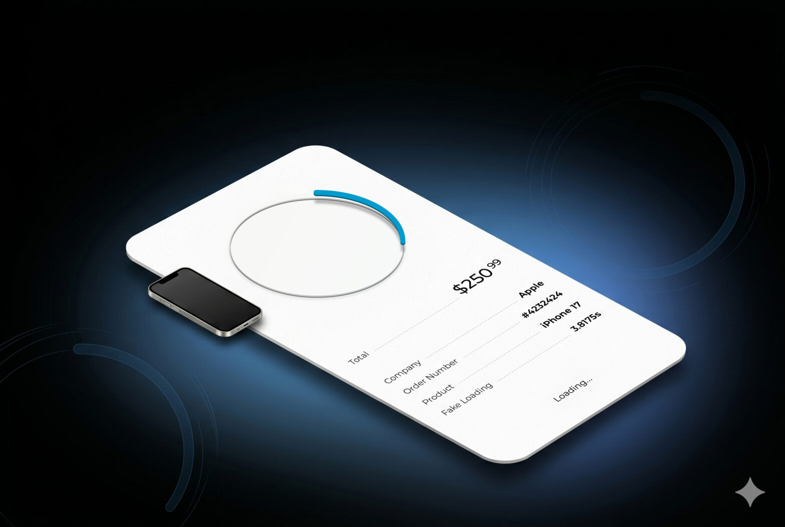
Have you ever seen the kind of loaders that become a Check or a Cross icon? Usually, they don’t actually transform; we just see a loader that is replaced by an image.
Something really smooth would be to have a seamless transition between the two, no matter the duration!
Check the example below and let’s dig into it.
The idea
If we look at the animation, we can see 2 steps:
1/ The loading animation: It’s a basic circle spinning on itself. The usual loader
2/ The transformation: The circle then morphs into a check (or cross) icon.
What we want here is simple: the loader spins as long as the process is loading. Once it’s done, we trigger the second animation where the circle transforms into the final shape.
Create the SVG on Figma
We basically need 2 shapes, which will be used as path for our animations:
- The circle for the loading part.
- The “Check” path for the end state.
First, create a frame with a circle inside. The circle doesn’t have to be centered in the frame, but make sure you place it inside a group.
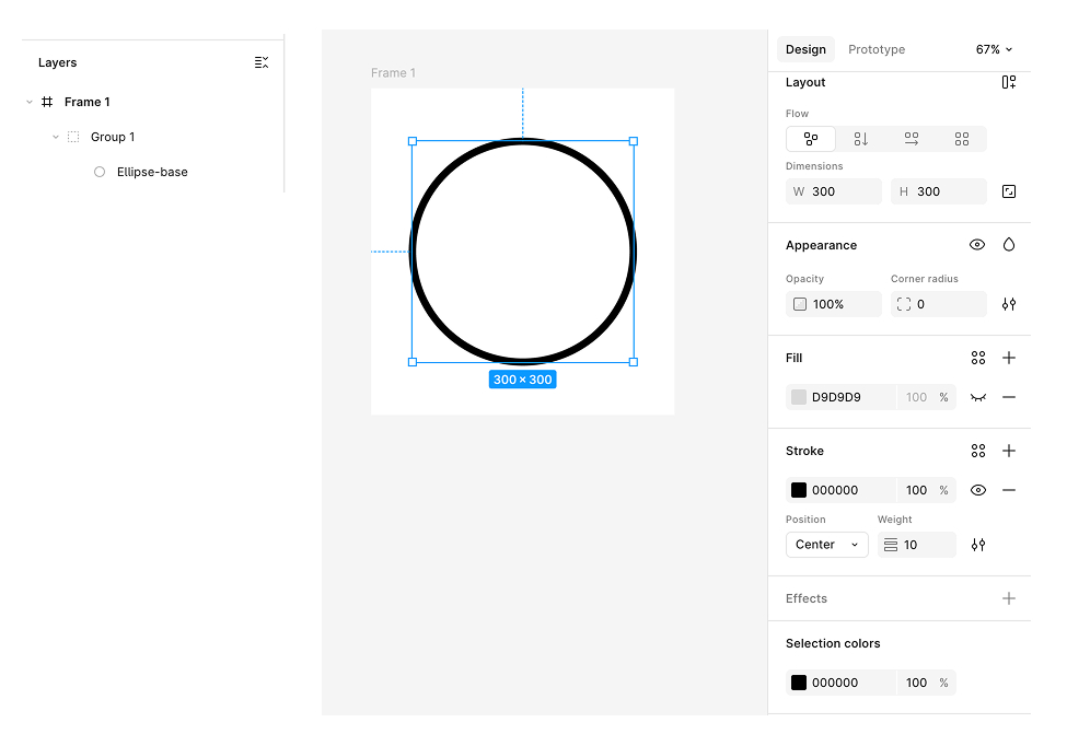
Basically, we will use this shape to have the loader spin around. We will have a spinner such as:
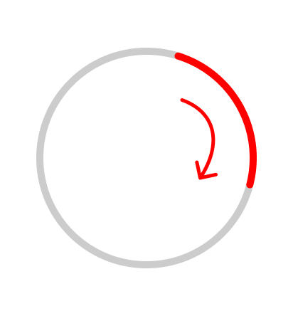
To understand the next step, we need to understand where the animation starts.
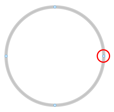
In an SVG circle, the path starts exactly on the right side of the circle. If you double-click on the circle, you will see the anchor points.
It is exactly this one:
It’s important to understand because what we want it to create a second shape, that will start exactly in this point, but will end up with another shape:
- duplicate the circle.
- From this new circle, shape it starting this exact point to have another shape (double click the circle and use the pen tool
- Make sure that your new shape and the circle are perfectly aligned
You end up with something like this:
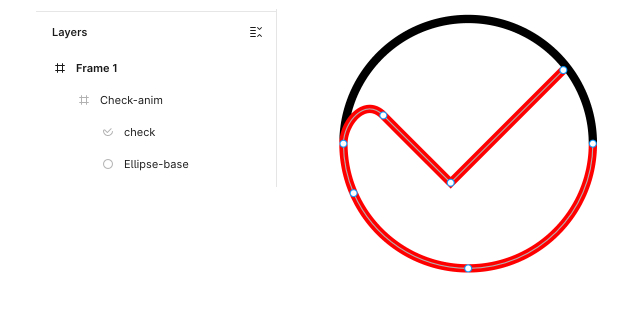
As you can imagine, the second part of the animation will now use this new path to end as a “check” shape. It will be perfectly smooth.
To make positioning during development easier, we want the red shape to be inside the circle. It can be positioned differently, but that would require some adjustments, which isn’t the point of this article.
Now, you just have to export your shape:
- In the layer panel, click the group.
- In the right-hand panel, export it as an SVG.
If you open the file, you should see something like this:
<svg
  width="310"
  height="310"
  viewBox="0 0 310 310"
  fill="none"
  xmlns="http://www.w3.org/2000/svg"
>
  <path
    d="M305 155C305 237.843 237.843 305 155 305C72.1573 305 5 237.843 5 155C5 72.1573 72.1573 5 155 5C237.843 5 305 72.1573 305 155Z"
    stroke="black"
    stroke-width="10"
  />
  <path
    d="M305 155C305 237.843 237.843 305 155 305C93.2971 305 40.2958 267.744 17.2639 214.5C9.37307 196.258 5 176.14 5 155C5 129.321 31 98.5 53.0066 121C75.0133 143.5 134 202 134 202L269.5 66.5"
    stroke="#FF0000"
    stroke-width="10"
  />
</svg>
The HTML
The HTML involves copying the SVG code from above and adding an ID to each path so we can select them later with JavaScript.
We also add an is-hidden class to our checkmark path to hide it initially (we will create the CSS for this later).
<svg
  width="310"
  height="310"
  viewBox="0 0 310 310"
  fill="none"
  xmlns="http://www.w3.org/2000/svg"
>
  <path
    id="circle"
    d="M305 155C305 237.843 237.843 305 155 305C72.1573 305 5 237.843 5 155C5 72.1573 72.1573 5 155 5C237.843 5 305 72.1573 305 155Z"
    stroke="black"
    stroke-width="10"
  />
  <path
    id="circle-checked"
    class="is-hidden"
    d="M305 155C305 237.843 237.843 305 155 305C93.2971 305 40.2958 267.744 17.2639 214.5C9.37307 196.258 5 176.14 5 155C5 129.321 31 98.5 53.0066 121C75.0133 143.5 134 202 134 202L269.5 66.5"
    stroke="#FF0000"
    stroke-width="10"
  />
</svg>
That’s it.
If you check the GitHub file, you will see that I use a
<circle>instead of a<path>. This is because it’s a bit easier to manage, but you can keep whichever you prefer. It should still start at the same position.<circle id="circle" cx="155" cy="155" r="150" stroke="red" stroke-width="10" />
The CSS
The only thing to note is
#circle,
#circle-checked {
    stroke: #029bce;
    stroke-linecap: round;
}

&.is-hidden {
    opacity: 0;
}
To change the color and to have rounded end of lines. Is-hidden is used to display and hide our shapes.
The animations with GSAP
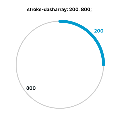
strokeDasharray & strokeDashoffset
Now, let’s dive into the animation. We’ll be using GSAP because it makes manipulating and updating SVG paths incredibly straightforward.
Before we start coding, let’s look at the two CSS properties we’ll be animating:
- strokeDasharray: This defines the length of the dashes and the gaps between them in the stroke.
- strokeDashoffset: This defines where the dash pattern begins along the SVG path
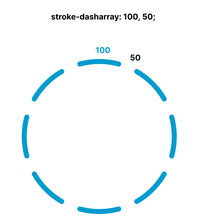
So in order to have a 200px line on a circle (or any shape), if the length is 1000, we will need a stroke-dasharray of `200, 800`
Now that we know that, let’s start to animate it
The 4 steps we need
To achieve this effect, we’ll break the animation down into four distinct phases:
1/ The start: Animate the stroke from 0 to 200px to make the loader “appear.”
2/ The loading loop: Keep the line spinning around the circle for as long as the data is fetching.
3/ Prepare the final position: Once loading is complete, force the line to its final position to prepare for the morph.
4/ The reveal: Launch the final animation using the second SVG path (the checkmark).
It’s worth noting that steps 1, 2, and 3 all utilize the primary circle path, while step 4 switches to our second SVG.
This is exactly why having both SVGs start at the same coordinate is vital. If they match perfectly, the hand-off between step 3 and step 4 will be invisible to the user—it will look like one continuous, fluid motion even though we’re switching paths!
Let’s get our animations ready.
Using GSAP for animations
First, we need to dynamically prepare our SVG paths. We’ll set up some constants and calculate the path lengths to ensure the animation is precise.
const MAIN_DURATION = 0.8;
const LINE_LENGTH = 200;
const pathCircle = document.querySelector("#circle");
const pathChecked = document.querySelector("#circle-checked");

const pathCircleTotalLength = pathCircle.getTotalLength();
const gapCircleLength = pathCircleTotalLength - LINE_LENGTH;

gsap.set(pathCircle, {
  strokeDasharray: `${LINE_LENGTH} ${pathCircleTotalLength}`,
  strokeDashoffset: LINE_LENGTH,
});
gsap.set(pathChecked, {
  strokeDasharray: `${LINE_LENGTH} ${pathCircleTotalLength}`,
});
Using gsap.set effectively “hides” our line behind its starting point by offsetting the stroke. We also establish the default length for our second animation state.
Step 1: Make the circle appear
const animationStartCircleAppear = gsap.to(pathCircle, {
  strokeDasharray: `${LINE_LENGTH} ${gapCircleLength}`,
  strokeDashoffset: 0,
  duration: 0.3,
  ease: "power1.in",
  paused: true,
  onComplete: () => {
    animationCircleLoading.play();
  },
});
Our first animation brings the loader into view. We animate the strokeDashoffset to 0, which “draws” the line onto the screen.
Once this entry animation completes, we trigger the infinite loop.
Step 2/ The infinite spinning part
const animationCircleLoading = gsap.to(pathCircle, {
  strokeDashoffset: -pathCircleTotalLength,
  duration: MAIN_DURATION,
  ease: "none",
  repeat: -1,
  paused: true,
});
Next, we create the continuous loading motion. This animation moves the dash pattern around the circle indefinitely.
The repeat: -1 property tells GSAP to loop the animation infinitely. By animating strokeDashoffset to the negative value of the total path length, we make the beginning of the stroke “chase” itself around the circle, creating a seamless spinning effect.
Step 3/ preparing the end
const animationCircleLoadingEnd = gsap.fromTo(
  pathCircle,
  { strokeDashoffset: 0 },
  {
    strokeDashoffset: -pathCircleTotalLength,
    duration: MAIN_DURATION,
    ease: "none",
    paused: true,
    immediateRender: false,
    onComplete: () => {
      pathCircle.classList.add("is-hidden");
      pathChecked.classList.remove("is-hidden");
      animationCheck.play();
    },
  },
);
This step handles the transition from the infinite loop to the final result.
For this part, we use gsap.fromTo to ensure the animation starts exactly at the 0 position. When we trigger this once the loading is finished, we’ll calculate the correct entry point to ensure the transition is seamless. (We’ll dive into that logic in a moment!)
In the onComplete callback, we swap the paths by toggling the is-hidden class and then trigger the final checkmark animation.
Step 4/ the final
const animationCheck = gsap.to(pathChecked, {
  strokeDashoffset: -600,
  duration: MAIN_DURATION,
  ease: "power1.out",
  paused: true,
});
Since we already set up the default position, it will start at the exact same point as the previous one end. It will fill really smooth, but that’s the reason your 2 SVG must be perfectly aligned This time, we calculate the strokeDashoffset manually. It could have been calculated but by doing:
const pathCheckedLength = pathChecked.getTotalLength();

const animationCheck = gsap.to(pathChecked, {
  strokeDashoffset: - pathCheckedLength + LINE_LENGTH,
 ....
})
Call the animations
We’re almost there! Now it’s time to wire everything together and trigger the sequence.
First, we launch the entry animation, which—as we set up earlier—will automatically kick off the infinite loading loop once it finishes:
// 1st animation which also trigger the infinite loop
animationStartCircleAppear.play(0);

fakeRequestService.requestApi().then((response) => {
    // When the api is resolved
    // we stop the current looping animation
    animationCircleLoading.pause();
    // we calculate current progress of the animation, and apply it to the 3rd one
    const t = animationCircleLoadingEnd.duration() * animationCircleLoading.progress();
    animationCircleLoadingEnd.seek(t);
    animationCircleLoadingEnd.play();
});
And that’s it! Your super fluid asynchronous loader is now ready.
The beauty of this setup is that the logic is independent of the design. Now that the code is solid, you can swap out the SVG paths to create transitions for any other shape—like a warning triangle or a “success” star—without changing a single line of JavaScript!
Feel free to test the code on GitHub, there are a few other patterns.
Have fun!